

Understanding Color, Hue, Chroma, and Saturation in Painting
Discover the crucial differences between color, hue, chroma, and saturation in painting, and how these elements can dramatically affect the composition and emotional impact of your artwork. Gain insights into how each aspect contributes to the overall visual experience and learn to harness their power to create dynamic, resonant pieces. Click the image above to read more.
Color is an integral part of painting and can significantly influence the overall composition and emotional impact of a piece. To truly harness its potential, it's essential to understand the nuances of color, hue, chroma, and saturation. Each of these elements plays a distinct role in how we perceive and interpret a painting.
Color: The Foundation of Visual Experience
Color is the umbrella term that encompasses hue, chroma, and saturation. It is what our eyes perceive when light is reflected off a surface. The use of color can set the tone of a painting, evoke emotions, and draw the viewer’s eye to specific areas. For instance, warm colors like red and orange can create a sense of warmth and excitement, while cool colors like blue and green can evoke calm and tranquility.
Hue: The Identity of Color
Hue refers to the pure spectrum colors that are found in the color wheel—red, blue, yellow, etc. It is essentially the name of the color. Hues form the basis of color theory and are fundamental in creating a harmonious or contrasting palette. In a painting, the choice of hues can guide the viewer's emotional response and highlight particular aspects of the composition. For example, complementary hues, such as blue and orange, can create striking visual contrasts.
Chroma: The Intensity of Color
Chroma, also known as saturation or intensity, refers to the purity and strength of a color. High chroma colors are vivid and bright, while low chroma colors are dull and muted. The use of chroma in a painting can create a sense of depth and dimension. High chroma areas can draw attention and create focal points, whereas low chroma can recede into the background, adding subtlety and nuance to the composition.
Saturation: The Purity of Color
Saturation is often used interchangeably with chroma, but it can also refer to the degree to which a color is free from white or gray. Highly saturated colors are vivid and rich, while desaturated colors appear more washed out or pale. In a painting, varying the saturation of colors can help create a sense of movement and balance. For example, a highly saturated foreground against a desaturated background can create a sense of distance and perspective.
The Impact on Composition
Understanding and manipulating these aspects of color can greatly impact the overall composition of a painting. Here’s how they can work together:
Emotion and Mood: The choice of hues can set the overall mood of the painting—whether it’s vibrant and energetic or calm and serene.
Focus and Attention: High chroma areas can act as focal points, drawing the viewer's eye to key elements within the painting.
Depth and Dimension: Varying saturation can create a sense of depth, with saturated colors appearing closer and desaturated colors receding.
Harmony and Contrast: A well-balanced use of hues and their complementary colors can create harmony or striking contrasts, depending on the desired effect.
Mastering the interplay of color, hue, chroma, and saturation allows artists to create more dynamic and emotionally resonant paintings. By thoughtfully applying these concepts, artists can guide the viewer’s experience, evoking the intended emotional and visual impact.
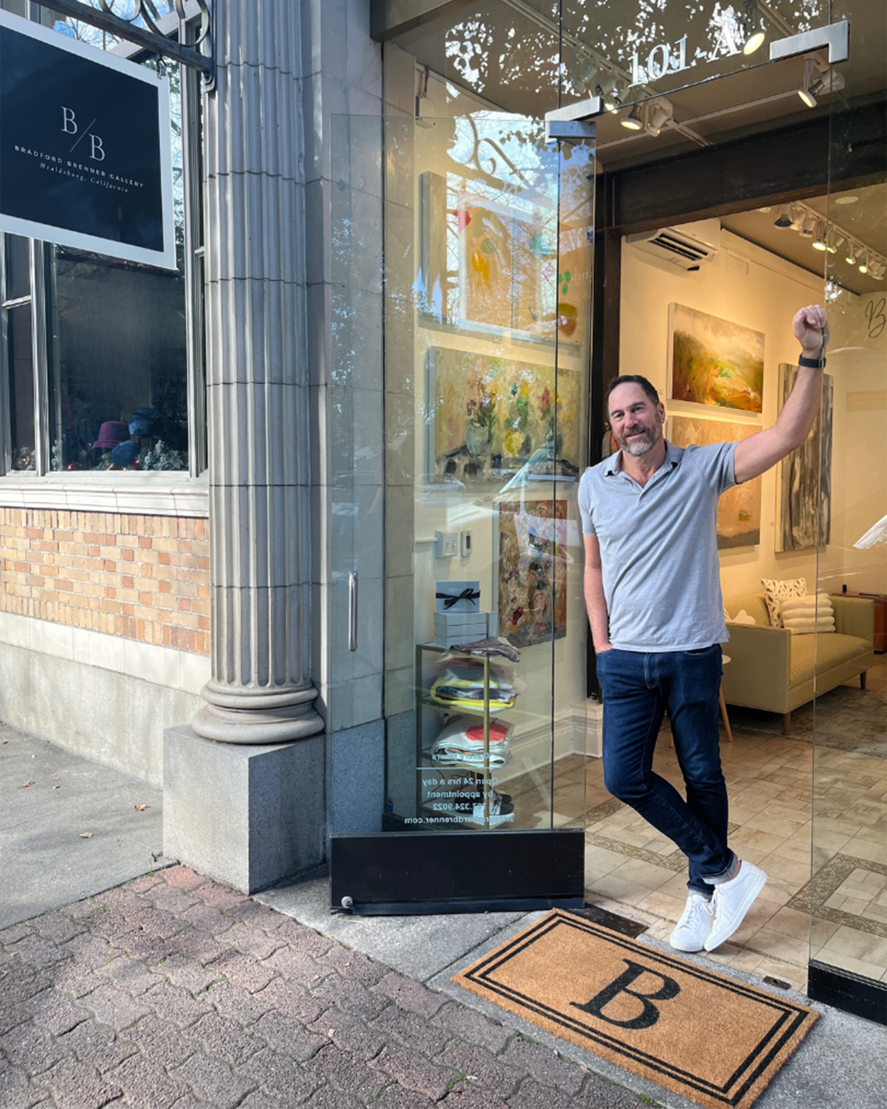
Bradford discusses understanding color, hue, chroma, and saturation in painting

ABOUT THE AUTHOR & ARTIST: BRADFORD BRENNER
Born June 9th, 1959 in New York City, NY to art collector parents, Bradford Brenner has been a professional artist for the last 35 years. His work has been featured in numerous national art publications and can be found in private and corporate collections throughout the world. Brenner’s gallery and studio is located on the historic Plaza in Healdsburg, CA.
Brad received his education from both University of California, Santa Barbara and San Diego State. Receiving creative inspiration and ideas intuitively, his emotive imagery and loose brushstrokes reflect an instinctive and intuitive spirit. Collectors are drawn to the freedom and looseness that represents his unique style, and highly spontaneous rich, multi-layered works. Brenner draws upon a wealth of artistic influences, including his passion for and study of the Old Masters, the Impressionists, the Tonalists and the Abstract Expressionists to create a style that is uniquely his own.

The Importance of Composition in Painting
In the world of art, composition is the backbone of any successful piece. It’s the arrangement of elements within a work that guides the viewer’s eye and evokes emotion. A well-composed painting can transform a simple subject into a captivating masterpiece, making composition a crucial skill for any artist. In this article, I’ll share my personal experiences in creating custom paintings and provide 10 helpful techniques for mastering composition. Click the image above to read the full article.
As an artist, I often find that the composition of a painting is just as crucial as the subject itself. Composition is the backbone of any artwork, guiding the viewer's eye and creating a sense of harmony and balance.
About 30 years ago, I was commissioned to create a floral painting for a client who had a specific request: they wanted a horizontal painting primarily featuring a large floral. Typically a vertical composition is something I often gravitate towards, as it naturally draws the eye upward and creates a sense of elegance.
However, given the horizontal format requested by the client, I knew that a single flower in the middle of the canvas would leave too much empty space on either side, resulting in an unbalanced and static composition. To address this, I decided to paint three separate florals in vases, each with its own unique characteristics.
By placing three vases across the canvas, I was able to create a more dynamic and balanced composition. The varying sizes and shapes of the vases, along with the different types of flowers, added visual interest and movement. This arrangement also allowed me to play with the negative space between the vases, ensuring that the entire canvas was engaged and visually appealing.


This experience reinforced my belief that composition is not just about placing elements within a frame; it's about creating a visual journey for the viewer. A well-composed painting can evoke emotions, tell a story, and draw the viewer in, making them feel connected to the artwork.
Composition is a fundamental aspect of painting that should never be overlooked. Whether working with a vertical or horizontal format, it's essential to consider how the elements within the painting interact with each other and the space around them. By doing so, we can create artworks that are not only visually pleasing but also deeply engaging.
Improving compositional skills is essential for any artist looking to create balanced and engaging artwork. Here are some techniques that can help improving your compositional skills:
Rule of Thirds: Divide your canvas into a 3x3 grid and place key elements along these lines or at their intersections. This creates a more dynamic and balanced composition.
Leading Lines: Use lines within your artwork to guide the viewer's eye towards the focal point. These can be actual lines or implied lines created by the arrangement of elements.
Balance: Ensure that your composition feels balanced. This can be achieved through symmetrical or asymmetrical arrangements. Balance doesn't mean everything has to be equal, but rather that the composition feels stable.
Contrast: Use contrast in color, texture, and size to create interest and draw attention to certain areas of your painting.
Negative Space: Pay attention to the space around your subject. Negative space can help define the subject and create a more pleasing composition.
Focal Point: Establish a clear focal point to draw the viewer's eye. This can be achieved through contrast, placement, or detail.
Simplification: Sometimes less is more. Simplifying your composition can help to focus on the main elements and avoid clutter.
Movement: Create a sense of movement by arranging elements in a way that leads the viewer's eye through the painting. This can be done with curves, diagonals, or repeated shapes.
Perspective: Use perspective to create depth and dimension in your composition. This can be achieved through techniques like overlapping, size variation, and linear perspective.
Thumbnail Sketches: Before starting a painting, create small, quick sketches to explore different compositional ideas. This helps to visualize and refine the composition before committing to the final piece.
By practicing these techniques, artists can develop a stronger sense of composition and create more compelling and visually appealing artworks.

ABOUT THE AUTHOR & ARTIST: BRADFORD BRENNER
Born June 9th, 1959 in New York City, NY to art collector parents, Bradford Brenner has been a professional artist for the last 35 years. His work has been featured in numerous national art publications and can be found in private and corporate collections throughout the world. Brenner’s gallery and studio is located on the historic Plaza in Healdsburg, CA.
Brad received his education from both University of California, Santa Barbara and San Diego State. Receiving creative inspiration and ideas intuitively, his emotive imagery and loose brushstrokes reflect an instinctive and intuitive spirit. Collectors are drawn to the freedom and looseness that represents his unique style, and highly spontaneous rich, multi-layered works. Brenner draws upon a wealth of artistic influences, including his passion for and study of the Old Masters, the Impressionists, the Tonalists and the Abstract Expressionists to create a style that is uniquely his own.

The Art of Scale: Why Getting Artwork Size Right Matters
When it comes to decorating a space, the scale of artwork is a crucial element that can make or break the overall aesthetic. Over the decades, I’ve seen how the right size can transform a piece from merely decorative to truly captivating. In this article, we’ll delve into the different reasons why getting the scale right is so crucial. Click the image above to read the full article.
When it comes to decorating a space, the scale of artwork is a crucial element that can make or break the overall aesthetic. Over the decades, I’ve seen how the right size can transform a piece from merely decorative to truly captivating. Here’s why getting the scale right is so crucial from my perspective:
1. Proportion to Wall Size
One of the first lessons I learned was the importance of proportion. A piece that is too small on a large wall can feel insignificant, while an oversized piece on a small wall can overwhelm the space. The key is to find a balance that complements the wall without overpowering it. Typically, I aim for my artwork to cover about two-thirds to three-quarters of the wall space, creating a harmonious relationship between the art and its surroundings.
2. Relationship to Surrounding Furniture
Artwork should also be scaled in relation to the furniture around it. For instance, a large painting above a sofa should be roughly two-thirds the width of the sofa to create a cohesive look. This principle applies to other pieces of furniture as well, such as console tables or beds. The artwork should enhance the furniture, not compete with it.
3. Focal Point Considerations
When a piece is intended to be the focal point of a room, such as above a fireplace, its size becomes even more critical. A piece that is too small will fail to draw attention, while one that is too large can dominate the space and disrupt the room’s balance. The artwork should be large enough to command attention but still leave some breathing room around it.
4. Creating a Statement Wall
Creating a collage or gallery wall requires careful consideration of scale. Mixing different sizes can add interest and dynamism, but it’s important to plan the layout carefully. Larger pieces should anchor the arrangement, with smaller pieces filling in the gaps. This approach ensures that the collection works together as a cohesive whole.
5. Enhancing the Room’s Atmosphere
The right scale can enhance the room’s atmosphere and make it feel more inviting. Large, bold pieces can add drama and make a statement, while smaller, more delicate pieces can create a sense of intimacy and calm. Understanding the mood you want to create can help guide your choices in artwork scale.
6. Impact on Different Art Mediums
Different art mediums interact with scale in unique ways:
Paintings and Drawings: Larger canvases allow for more detail and can create a powerful visual impact, while smaller pieces can draw viewers in for a more intimate experience. The scale can also affect the viewer’s emotional response, with larger works often evoking a sense of awe and smaller works a sense of closeness.
Sculpture: The scale of a sculpture can dramatically change its presence in a space. Large sculptures can dominate a room and become a central feature, while smaller sculptures can be more subtle and complement other elements in the room. The material and form of the sculpture also play a role in how its scale is perceived.
Photography: The scale of a photograph can influence its impact and the viewer’s engagement. Large-format prints can immerse the viewer in the scene, while smaller prints can create a more personal connection. The subject matter and composition of the photograph can also dictate the most effective scale.
Mixed Media and Installations: These works often rely on scale to create an immersive experience. The size and arrangement of the components can transform a space and engage viewers in a multi-sensory experience. The scale can also influence how viewers move through and interact with the installation.
Getting the scale of artwork right is essential for creating a balanced and harmonious space. It’s about more than just fitting a piece on a wall—it’s about ensuring that the artwork enhances the room and complements its surroundings. By considering the size of the wall, the relationship to furniture, the intended focal point, and the overall atmosphere, you can choose artwork that truly elevates your space.
ABOUT THE AUTHOR & ARTIST: BRADFORD BRENNER
Born June 9th, 1959 in New York City, NY to art collector parents, Bradford Brenner has been a professional artist for the last 35 years. His work has been featured in numerous national art publications and can be found in private and corporate collections throughout the world. Brenner’s gallery and studio is located on the historic Plaza in Healdsburg, CA.
Brad received his education from both University of California, Santa Barbara and San Diego State. Receiving creative inspiration and ideas intuitively, his emotive imagery and loose brushstrokes reflect an instinctive and intuitive spirit. Collectors are drawn to the freedom and looseness that represents his unique style, and highly spontaneous rich, multi-layered works. Brenner draws upon a wealth of artistic influences, including his passion for and study of the Old Masters, the Impressionists, the Tonalists and the Abstract Expressionists to create a style that is uniquely his own.